by fmadmin | Nov 6, 2023 | Content, Design, Digital
10 factors to consider when deciding who will build your website
So, you need a new website. Maybe you’re considering hiring a web developer, or perhaps you’re eager to invest in a full-service marketing agency.
An online presence is non-negotiable for any business, serving as your virtual storefront and the first interaction between you and your potential customers. At Focused Marketing, we are often approached by clients who want to create a new website but are wondering who to help them.
A full-service agency may be a larger upfront investment than hiring a web developer, but prices must be weighed up against which route will deliver the best value for money against your requirements. A developer and an agency can both build a website, but an agency will also ensure it does what it’s meant to – whether that be educating, engaging, or converting visitors into customers.
Below, we outline ten factors with crucial questions to ask when considering a developer vs. marketing agency. If you or your developer can’t answer these, you may need to talk to a marketing agency!
1. Goal-oriented conversion, customisation and optimisation
The first thing to consider is the purpose of your website. An agency will take the time to get to know your business and ensure it’s fit for purpose. Marketing agencies employ conversion optimisation techniques, encouraging actions that align with your business goals, be it making a purchase, completing a form, or subscribing to a newsletter. With a collaborative team of creatives – graphic designers, website developers, UX/UI specialists, and copywriters—they ensure that your online presence is visually appealing and optimised for a seamless user experience.
From layout and design to content and functionality, agencies customise every aspect of your website. Graphic designers create elements aligned with your brand identity, web developers ensure a responsive interface, UX/UI specialists focus on user experience, and copywriters craft persuasive content guiding visitors toward conversion actions.
Consider:
- What strategies are in place to continually refine and improve the conversion rate over time?
2. Capturing attention (within seconds)
You have about 8 seconds to capture the attention of a visitor before they leave your site. Marketing professionals within an agency understand this and will craft your website content to engage upon first glance.
“Users often leave webpages in 10 – 20 seconds, but pages with a clear value proposition can hold people’s attention for much longer. To gain several minutes of user attention, you must clearly communicate your value proposition within 10 seconds.” – Jakob Nielsen
Consider:
- Do you know how to optimise your homepage to deliver a compelling message?
- Are you using visual elements to resonate with your audience within those crucial seconds?

At 8 seconds, the average attention span is shorter than that of a goldfish
3. Creating lasting connections
Visual appeal is your secret weapon against fleeting attention spans. A design that is both unique and memorable ensures visitors don’t just pass through but forge a lasting connection with your brand. Think of your website as a visual storybook – each page should unfold a narrative that captivates and leaves a lasting imprint in the minds of your audience. Marketing agencies don’t create websites alone, they are experts at creating experiences that resonate.
Consider:
- To create a lasting impression, how will you ensure your website design is aligned with your brand guidelines?
4. Tailoring content for clarity and engagement
You might know your product inside-out, but struggle with effectively communicating the benefits it offers. A marketing agency not only creates or refines your content, but tailors it for your target audience.
Consider:
- Do you have a content strategy that will connect with your audience?
- How will you use content optimisation techniques to enhance search engine visibility and user engagement?
5. Ensuring accessibility and audience-centric writing
Creating content for an audience unfamiliar with your industry requires a delicate balance of education and persuasion. Many brands struggle to write for an audience who is unfamiliar with their products or services. Marketing agencies have the skills to bridge this gap, ensuring web content connects with the target audience. This extends beyond language – website design and content must be tailored to ensure accessibility for all users.
Consider:
- How well does your content resonate with your audience personas?
- What strategies do you use to tailor your messaging to different audience personas?
- How will you ensure content and web design is inclusive of all users?
6. Elevating your website from existence to discovery
A developer might build a functional website, but without on-page SEO, your site might get lost in the digital noise. Marketing agencies optimise your website for search engines, making sure your potential customers can find you.
“Think of your website as an island, metaphorically speaking. You may have a beautifully designed and constructed virtual destination, the only problem is your guests can’t find you on the map! Unless you provide a way for viewers to easily find and travel to your website, there is no point renovating it.” – Jessica Bye, Focused Marketing
Consider:
- Beyond the development phase, how will you optimise your website for search engines?
- How do you ensure your website is discoverable and easily navigable for your target audience?
7. Creating a seamless path to conversion
Every piece of information on your website should have a purpose and a placement. Understanding the path your visitors take is crucial in ensuring that every piece of information contributes to the overall user experience.
Marketing agencies strategically organise your content, guiding visitors through a journey that leads to conversion.
Consider:
8. Highlighting your brand’s USP through strategic messaging
Your unique selling proposition (USP) and key messaging must convince and compel your audience. Marketing agencies delve deep into understanding the intricacies of your business, conducting analysis to identify what distinguishes you from the competition.
Through understanding the nuances of your products, services, and values, a marketing agency will assist you in ensuring your value proposition shines.
Consider:
- Are you confident that your website effectively communicates your USP?
- How have you refined and communicated your USP to ensure that visitors understand what sets your business apart in the competitive landscape?
9. Creating an empowering user experience
We’ve all used websites that are unclear or downright frustrating. Visitors should effortlessly glide through your website, finding information intuitively and without friction. How visitors interact with your site greatly impacts their perception of your brand.
A marketing-focused approach optimises user experience, ensuring seamless navigation and encouraging visitors to explore further and ultimately convert. Marketing agencies employ user-centric design principles, strategically placing elements to guide visitors with clarity. This isn’t just about making navigation easy; it’s about creating an experience where visitors feel empowered and in control of their journey.
Consider:
- How will you design and evaluate your site’s visitor journey?
10. Your website is never finished!
The digital landscape is ever-evolving. A marketing agency doesn’t just build your website and leave; they continually analyse data, gather insights, and make improvements to ensure your online presence stays effective and competitive.
Consider:
- How will you continually improve your online presence? What measures will you use to respond to changing trends and user behaviour?
A developer can create a perfectly functional website, but it takes a marketing-focused agency to transform it into a powerful sales and branding tool. Remember, your website isn’t just a digital placeholder, it’s an interactive experience that can make or break your business. Invest wisely, because the right website isn’t an expense – it’s an investment in the future success of your business.
For more information and assistance with your marketing strategy, contact our team at Focused Marketing and make it happen!

by fmadmin | Oct 5, 2023 | Content, Design, Training
In honour of 10 years of everyone’s favourite accessible design platform, we’re sharing our top 10 tips and tricks for non-designers.
Canva’s simplicity, affordability and ease of use makes it an excellent tool in the belt for business marketing. However, many users don’t have a background in design and are learning on the fly, which means the quality of output suffers. While it’s worth investing in professional graphic design services, Canva definitely has its place – but please use wisely 😉
Here’s our top 10 tricks for beginners looking to harness the power of Canva for business purposes.
1. Use Brand Kits for consistency
Brand Kits are an excellent feature that is available to Canva Pro users. A Brand Kit is a style library of sorts that allows you to define your company logos, colour palette, fonts, and even photography, graphic elements, and icons. Brand Kits streamline the design process and make it easy to create consistent and on-brand designs that will strengthen your brand recognition and trustworthiness. (And earn you brownie points with your marketing team.)
- Consistency is key: Ensure that your designs align with your brand’s visual identity. If you look at a visual overview of your branded materials, does your design feel like part of the family?
2. Be conscious of spacing and alignment

The guidelines are there for a reason! Watch out for spacing and alignment.
Image credit: Imgflip
Paying attention to spacing and alignment will make your designs appear more polished and professional.
- Are elements too close to each other, or the page edge? Use Canva’s built-in page margins to make sure key elements like text aren’t sitting too close to the edge of the page. Allow “breathing room” around elements so they don’t look too crowded.
- Are elements aligned to each other? Consistent alignment and spacing will make your design tidier and more unified. Use the “Position” tool in the top menu bar to easily align elements.
3. Create balanced designs
Learning to create visually balanced designs is a somewhat intuitional skill you’ll pick up over time.
- Do: Use a mix of left and right-aligned elements to help balance each other out. Centred layouts usually look best when everything is centred.
- Don’t: Use a mix of left, right, and centre-aligned elements as this tends to look messy.
4. Keep it simple
Canva is constantly rolling out new features and additional effects, filters and more. But try not to be tempted by all that seems cool and shiny, and always refer to your brand guidelines or Canva Brand Kit. Your friendly local graphic designer is begging you to PLEASE step away from that drop shadow or neon text effect. Simple designs are often the most impactful – and harder to mess up 😉
- Less is more: Stick to a clean design whenever possible, avoid cluttering your designs with unnecessary text or graphics.
- Choose a focal point: Highlight one central element or message in your design to make it stand out. Use colour, size, or positioning to draw attention to this focal point.
5. Typography matters

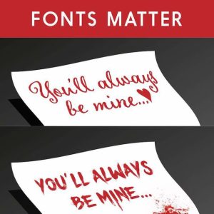
When font selection goes wrong. Stick to your brand fonts, always!
Image credit: Digital Synopsis
Typography can make or break a design.
- Stick to your brand fonts: Always refer to the font styles defined by your brand guidelines and don’t go astray with random fonts, no matter how much you like them!
- Create a clear typographical hierarchy: Use different weights and sizes for headings, subheadings and body text.
- Be mindful of readability: Make sure your text stands out against the background.
6. Keep your project library tidy
I know it’s boring, and we can all be guilty of letting our filing system slide – but keeping your designs organised will really help in the long term! It’s easy for your project library to become cluttered over time. When it’s challenging to find what you need quickly, design consistency can also take a hit.
- Create folders and group designs: I also like to keep related projects – e.g. a series of social posts for one month – all in one design with multiple pages, rather than making a new design each time.
- Use descriptive names for easy searching: Avoid vague titles like “Design 1” or “Untitled”, that’s not going to be helpful later on!
- Be ruthless about archiving and deleting: Archive designs you no longer need but want to be able to retrieve, and delete unused designs to streamline and free up space.
7. Get to know the basic shortcuts
Familiarising yourself with the commonly used shortcuts can do wonders for speeding up your workflow.
- Layers: Canva, like most graphics applications, works in a layering system where elements or groups of elements each sit on their own layer. With multiple overlapping elements on the page, it can become tricky to select and edit specific layers. One of my favourite shortcuts that’s often overlooked is Control + clicking on an element to select the one below. The shortcuts to Send Backward, Send Forward, Send to Back and Send to Front are also very useful.
- Copying elements: Option + clicking and dragging an element will make a copy, while Option + Shift + clicking and dragging an element keeps the copied element snapped in place vertically or horizontally which is great for keeping your design tidy.
- Grouping: Grouping objects together can also make designs easier to manage. Simply use Control + G and Control + Shift + G to group and ungroup.
8. Spell-check is magic

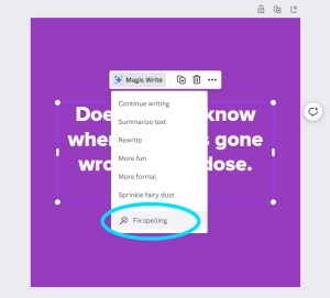
Make the most of Canva’s built-in spell-check feature.
This isn’t Canva-specific, but please, PLEASE keep an eye out for typos and grammatical errors in your designs. A business that consistently puts out content riddled with spelling mistakes comes across unprofessional.
- “Fix spelling” in Canva: This is a built-in spell-check tool offered by Canva. Simply select a text box, click Magic Write, then select “Fix spelling” from the dropdown menu. Abracadabra!
- Even the best magicians need an assistant: Get someone else to double check your design if possible. Sometimes even the most glaring of typos can slip past when you’ve been looking at a design for too long – so getting a second set of eyes is always a good idea.
9. Share and collaborate on your designs
Canva offers some great features for easy collaboration within your organisation or with external contributors (like your marketing/design team).
- Use a collaboration link: Use this to share your design with others. You can set the permissions so the other person can view only, can make comments, or they can edit the design – even those without a Canva account. Learn more about collaboration links here.
- For more advanced users: Teams of 2 or more can enjoy premium Canva features plus even better team collaboration features by upgrading to a Canva for Teams account. Check out the pricing plans here.
10. Learn from Canva’s Design School
Canva offers a library of courses and tutorials ranging from basic design principles to advanced techniques.
- Check out Design School: Click here to explore Canva’s educational resources.
Canva is a versatile and user-friendly design platform that can greatly benefit businesses of all sizes. By following our top tips for beginners and continuing to hone your Canva proficiency, you can create effective designs that strengthen your brand’s image. Happy designing!
If you need further Canva training, help with Canva templates, or would like to level up with professional design services, our experts would love to help. Get in touch with Focused Marketing today.

by fmadmin | Mar 29, 2023 | Content, Design
A clear and consistent visual identity is essential to the success of any thriving business. Your visual identity communicates your brand personality, sets you apart from competitors, makes your product or service recognisable, and establishes professionalism and trust.
Brand guidelines, also known as style guides, are a set of instructions that define how various aspects of your brand identity should be applied. They outline the rules for visual factors like your logo, typography, colour palette, and collateral, and often also include key messaging, tagline, tone of voice, and other elements of your brand. There are many people who will use your brand – whether it’s employees, marketing agencies, partner organisations, or industry bodies. A clear set of guidelines will provide direction that will ultimately safeguard the quality and integrity of your brand identity.
Here’s our top 4 reasons why brand guidelines are worth investing in:
Consistency
Establishing consistency across all touchpoints of your brand is critical in driving trust. By providing specific rules for using your brand assets, you can ensure that every piece of content looks and sounds like it comes from your business. This consistency builds trust with your audience and makes your brand more recognisable.
Clarity
Clear guidelines help all stakeholders use your brand with confidence, especially if they don’t come from a design background. It also helps everyone make decisions on how to represent your brand in different contexts. Brand templates make a huge difference as well – read more on our templating blog.
Save time
Having all of your standards set out in one document makes it easy to reference. Brand guidelines simplify decision-making and streamline design and production processes, saving you time and resources. They also reduce the likelihood of errors, like using the wrong logo or colour, saving time on potential revisions down the track.
Add value
Having a cohesive brand identity will make you appear more professional and trustworthy. By investing in strong and consistent branding, businesses can strengthen their reputation, attract and retain customers, and ultimately increase their bottom line.
Brand guidelines are an essential tool for every business to help build a powerful brand. They foster consistency, clarity, save time and add value.
If your business is in need of a new or refreshed set of guidelines, we’d love to help. Contact us to Make It Happen!

by fmadmin | Jun 21, 2021 | Design
We get it – when it comes to graphic design, it can sometimes seem like one of those things where you can cut corners. Your friend’s neighbour’s son might say he’s pretty nifty and offer to whip you up a logo in Powerpoint. Or you might be lured in by one of those increasingly ubiquitous online marketplaces that offer design services at prices that are too good to be true. Unfortunately, hiring an amateur designer or attempting to DIY can have a negative impact on your brand image, and consequently, your business. Effective visual communication is crucial to building a trusted, successful brand. Here’s our top 5 reasons why professional design services are worth investing in!
1. Make a positive, lasting first impression
Dodgy design can be an instant turn-off for potential clients or customers. It reflects poorly on your business and can make you appear unprofessional and unreliable. On the other hand, an experienced graphic designer will be an expert in visual communication. They’ll deliver high quality design that will strengthen your brand image, positioning you as a professional, credible brand. One that your customers want to be a part of.
2. Save time and money
“Design adds value faster than it adds costs.” – Thomas C. Gale. Graphic design should be an essential component of your business expenses – your time is better spent doing what you do best in business. A skilled graphic designer can create something far more effective and in a fraction of the time it would take a non-designer, or to attempt yourself. And importantly, they’ll get it right the first time. If you start off with a poorly designed logo or website for example, chances are at some point it will need to be redone and end up costing you all over again. High quality design converts and is a future-proof investment that will pay itself off time and time again.
3. Bespoke designs that are perfect for their purpose
You get what you pay for rings true here. Online marketplaces (like Fiverr and friends) value price and speed, versus quality and care. They can offer such stunningly low rates because of an oversaturation of unskilled designers who frequently produce poor quality and/or unoriginal work. These online marketplaces also give the impression that design should be cheap, and that it has very little worth. This just isn’t the case! Not to mention the exploitative nature of these sites with their high commissions, questionable marketing and other problematic practices. In contrast, engaging a professional graphic designer will ensure you receive original, high quality designs that have been carefully and skilfully tailored for your precise preferences and needs.
Additionally, with the rapid uptake of Canva, we’re noticing the overuse of pre-formatted templated designs on social media. Certain templates start “trending” and are adapted by a huge array of businesses, and their online presences inevitably begin to look very samey. Canva is a great tool, but it’s worthwhile having a designer set up some customised, branded Canva templates to differentiate you from the masses.
4. High quality finished results
A graphic designer will have the creative capabilities, technical prowess and industry-leading software to get you the best results. They’ll have experience in outputting files to the right specifications for a range of digital or printed formats. They’ll know what to check and how to troubleshoot to make sure your finished artwork looks perfect. No pixelated, low-resolution photo or incorrectly formatted logo will stand a chance. They’ll also be happy to talk you through why certain design choices have been made, or advise on paper stocks, special finishes, or creative touches that will elevate the design even further. In short, they’ll be an expert in their field, and will work with you to achieve excellent results.
5. Reap the rewards of consistency
Consistency builds credibility. When you find a designer (or creative team) that you “click” with, it pays to stick with them over time. A good designer will get to know your brand inside out and know how to best translate it visually, and in a cost and time-efficient way. They’ll know your brand style guide front to back, and familiarise themselves with all the nuances of your visual identity. If your design responsibilities are continuously bounced from person to person (especially if they’re inexperienced), discrepancies are likely to slip through. Inconsistency cheapens your visual identity and causes it to lose focus. Building a strong working relationship with an experienced designer pays off, by resulting in consistent and on-brand design that builds customer trust and enables your brand to look its very best.
A good graphic designer is an expert in visual communication; how your brand presents itself to the world – an essential aspect of every business’s success. They want your business to look good, and to thrive. Our experienced team would love to help, so if you’re having doubts in the design department – please get in touch.

by fmadmin | Jun 3, 2021 | Design, Strategy
It’s difficult to get by or get noticed in business these days without creative marketing. In our everyday lives we’re barraged with marketing, and we encounter a huge number of brands on a daily basis – both consciously and subconsciously. When we’re choosing a specific product or service in a sea of similar offerings, the decision can be overwhelming. Therefore it’s important for brands to communicate their message in a unique and original way. To stand out in an increasingly flooded marketplace, creativity really does count.
A creative brand identity along with creative marketing will leverage your brand and make it stand out among your competitors. Sometimes there’s a fear of being “too” different. However, continuously innovating your marketing is key to capturing and holding your audience’s attention. Besides, who wants to be boring?
Creativity is memorable
If you present the same as all of your competitors, what is going to make the consumer remember you? Creative campaigns create a buzz around your brand. Whether it’s a striking and beautifully executed visual, or a clever and unexpected concept that is a bit cheeky and makes you smile – creative ideas engage the consumer and stick in their mind. Creative strategies distinguish your brand from the rest, creating differentiation and driving brand recognition and recall.
Creativity provokes emotional engagement
By surprising, even delighting the consumer with marketing that stands out, you’re more likely to create an emotional connection. As consumers, we are prone to becoming loyal to a specific brand even when the features of the product or service are equivalent (or sometimes even weaker) than their competition. We form emotional attachments to a brand, driven by associations and affiliations we make with their values. Creative marketing can inspire certain emotions – joy, nostalgia, amusement, excitement – that strengthens our connection with the brand and what it stands for. Playing it safe and relying on formulaic marketing tactics is far less likely to evoke an emotional response and make an impact on your audience.
Creativity makes magic
Creativity generates those magic moments in marketing where the consumer truly resonates with your product or service, and is inspired to take action. It is the magic that boosts performance, recognition and makes your brand memorable. So, how do you make magic? Sometimes it might just be divine inspiration but often, like many things, it’s good old-fashioned time, dedication and hard work. It’s taking the time to invest in the creative process. This often means forming a team for a brainstorm or workshop, in order to piece together seemingly unconnected ideas to form new ones.
Know your brand needs a creative boost but feel like you are lacking inspiration? Give us a call – sometimes it takes a fresh pair of eyes (or four) to spark that creative drive. But with a step outside the box, some imagination, and maybe even a little magic – we’ll make it happen.

by fmadmin | Mar 10, 2021 | Design
Typography (noun.) the art or procedure of arranging type or processing data and printing from it.
As graphic designers are taught at college, “good typography is invisible, bad typography is everywhere”. Good typography should go unnoticed and work silently for your brand. Typography is the foundation of your brand identity, and just as colour, photography and tone of voice all influence how your brand will be perceived and remembered, so too does the style of your typography – so it’s vital that it is well-considered and meaningful.
Nail your typography from the start
When you’re building (or refreshing) your brand, your logo will underpin your entire visual identity. Therefore the typeface used in your logo itself should be well thought-out and capture the essence of your business. This is where we can help! Usually we will undertake a brand strategy workshop at the offset to define your unique brand personality and where your business sits on the personality spectrum – whether you’re traditional or innovative, exclusive or accessible, loud or sensitive. All of these factors will influence the chosen typeface(s). Graphic designers have the tools and knowledge (as well as an extensive library of typefaces to choose from!) to select typography that will best embody your brand. Additionally, when we’re crafting the type in your logo we will customise it by tweaking the kerning and leading, and/or adjusting the forms of the letters, to create a distinguished arrangement of type that is unique to your brand.
In some cases the type can be strong enough to form the logo in its entirety; this style of text-only logo treatment is known as a wordmark or logotype. Wordmarks are used by some of the most iconic brands in the world – think Coca Cola, Google or Disney.
What’s the difference between a typeface and a font? Oftentimes these terms are used interchangeably, but technically they’re different things. A typeface is the overall “font family” and is comprised of multiple fonts at different weights and styles. So for example, Arial is a typeface, while Arial Bold Italic is a font.
Consistency is key
After the time and consideration spent crafting a logo and brand identity and carefully selecting the typefaces that work best for you, these should be kept as consistent as possible and be used in your marketing and communications across the board. Once your brand has been refined and established we will create a style guide, and typography will of course form a key part of these guidelines.

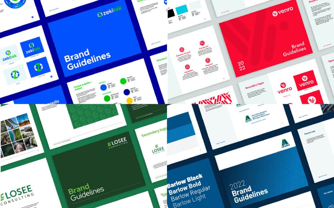
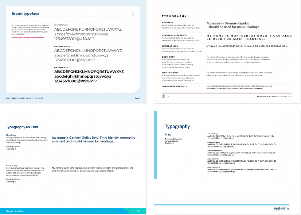
Examples of various style guides created by Focused Marketing and the pages describing typography
Generally we will select one to three typefaces that are suitable for usage across print and digital channels. These typefaces should then be applied across all of your marketing collateral. Typography is at its strongest and most subtle when it is kept consistent and simple. Remember that the best typography should go unnoticed – it will subconsciously be absorbed by the consumer and just make sense. Using a random mix of typefaces across different aspects of your brand is a big no-no, as it will water down your overall image. Sticking to the designated typefaces helps reinforce your brand image, which in turn establishes trust and recognition.
Not all typefaces are web-friendly. In this case we will advise of an alternative font that should be used on your website. As part of the style guide we will also advise of a default system typeface that would be used for your internal communications only, ie. a typeface that all users can easily access as it comes pre-installed on all devices – but wouldn’t be used across any of your external marketing.
Just as in fashion or music, trends in typography come and go over time – but these shouldn’t bear a strong influence over the choices made for your brand. The best typography is relevant, timeless, and won’t look outdated or tacky when the trend fades away. The longstanding popularity of iconic and beautifully designed typefaces like Helvetica, developed in the 1950s, are a testament to this.
We’re experts in brand development and can help you harness the power of great typography – so if your brand is in need of a boost, get in touch.
