by fmadmin | Jun 24, 2017
LOGO DESIGN | STYLE GUIDE | BILLBOARD DESIGN | STRATEGY WORKSHOP | MESSAGING
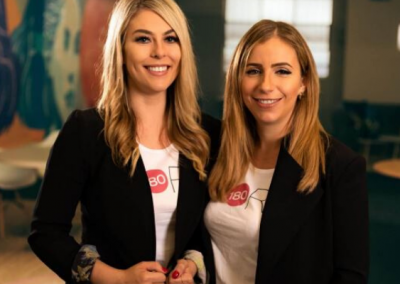
Gemma Lloyd and Valeria Ignatieva founded WORK180 after experiencing a working world that was failing women. Work180 is an innovatively transparent job board helping women around the world to confidently apply to workplaces with a proven commitment to diversity, inclusion, and gender equality.
Focused Marketing was first engaged to provide the creative for a billboard campaign that ran throughout Melbourne. In the process, we talked a lot about brand identity, message segmentation and how the business was perfectly placed to make a difference in an emerging #metoo world. That set us on a path to facilitating a workshop where we developed a strategy for extending brand reach.
Along the way, we designed a logo for the new name, choosing a strong but simple font that uses symmetry to communicate the company’s commitment to fairness and equality. We also transformed the letter ‘O’ into a pink dot, which is now used as an official seal of approval for endorsed employers.
Once Work180’s internal designers started applying the logo to brand assets, we captured everything in a comprehensive style guide to ensure consistency across all platforms.
Fast forward to now and the founders have become respected media commentators on women’s issues, the business has received backing from a group of serious investors and more recently, Work180 has launched in America and the UK.
by fmadmin | Nov 13, 2016
Department of Premier & Cabinet
Creative Direction | Fine Art | Graphic Design | Layout | Print Management | Proof-reading
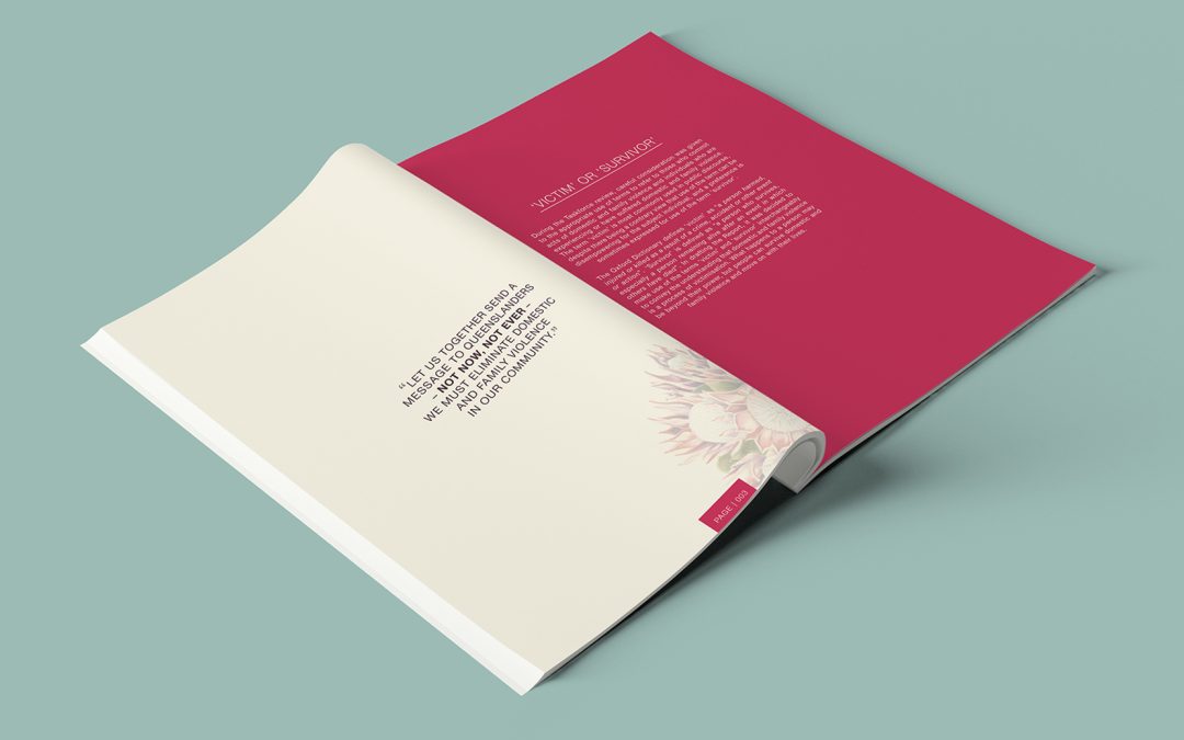
In 2015, the Department of Premier and Cabinet launched ‘Not now, not ever’, an initiative that aimed to combat the rise of domestic violence in Australia.
With Ex-Governor General Dame Quentin Bryce at the helm, the project required sensitivity, careful messaging and the management of a very tight deadline.
Focused Marketing was enlisted to pull everything together, including graphic design, layout, print management and regular communications with the committee.
As a symbolic campaign icon, a unique watercolour of a single flower was created, representing isolation felt by victims. This became the cover of an influential report and was later auctioned to raise funds for the important cause. It also appeared in regular press articles throughout Australia.

by fmadmin | Oct 13, 2016
BID MANAGEMENT | BRAND MANAGEMENT | COPYWRITING | GRAPHIC DESIGN
Focused Marketing was approached by Wild Desert to work alongside their management team to produce a successful tender submission for Santos South Australia.
To ensure Wild Desert achieved a tender document with the best chance of success, Focused Marketing developed a structured framework around key win themes. Focused Marketing also created infographics and diagrams to support the tender submission. Our team’s expert formatting skills ensured the document and all appendix items were cutting edge, professional, visually appealing and easy to navigate.
The final result was a compelling, comprehensive, and persuasive submission to Santos. Expertly project managed and submitted on schedule, Wild Desert were delighted with Focused Marketing’s attention to detail as well as the finished product, a stunning and visually-engaging tender submission.

by fmadmin | Jun 13, 2012
UQ School of Biological Science
BRAND DEVELOPMENT | GRAPHIC DESIGN | TRAINING WORKSHOPS
In mid 2013 The University of Queensland’s School of Biological Sciences, was looking to raise the profile of the school and its new postgraduate masters course. The challenge was to develop new branding for the school which complemented the existing parent brand of the university.
Focused Marketing developed a new visual identity for the school, drawing upon three major themes, international learning, biological science, and the overall student experience. The new design enabled the school to develop a clear identity which could run alongside the overall university brand.
The new postgraduate masters course generated hundreds of enquiries and resulted in over 20 full time participants signing up for the course.


