EPEC GROUP
REBRAND | LOGO DESIGN | STYLE GUIDE | WEB DESIGN | COPYWRITING | GRAPHIC DESIGN | FACILITIES BRANDING | TEMPLATE DESIGN | MARKETING ASSETS
BRIEF:
EPEC Group provide high voltage power engineering services to the renewable energy industry.
They approached Focused Marketing to undertake a brand refresh that would support their ambitious plans of growth within a space that is rapidly evolving.
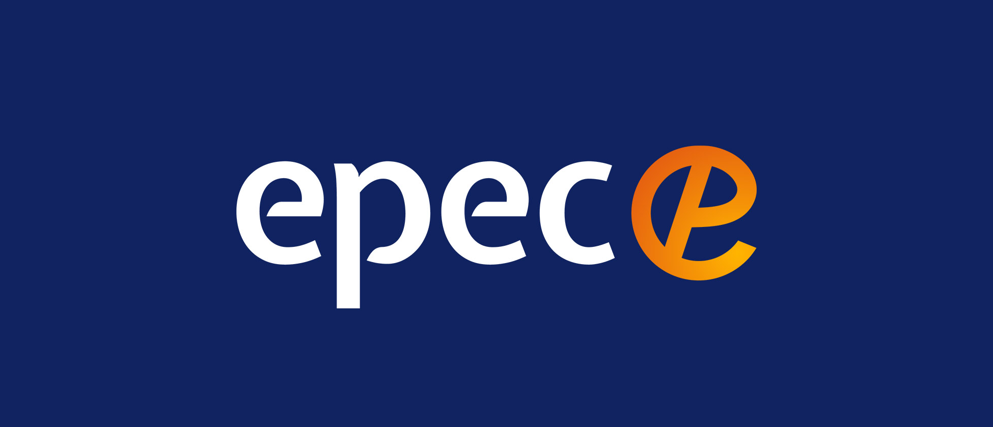
There were issues with the original logo being ambiguous and potential misinterpretations as “C P C C” rather than “E P E C”.
SOLUTION:
To kickstart the process, Focused Marketing conducted a brand workshop to draw out the brand values and personality that would drive the brand development and marketing goals.
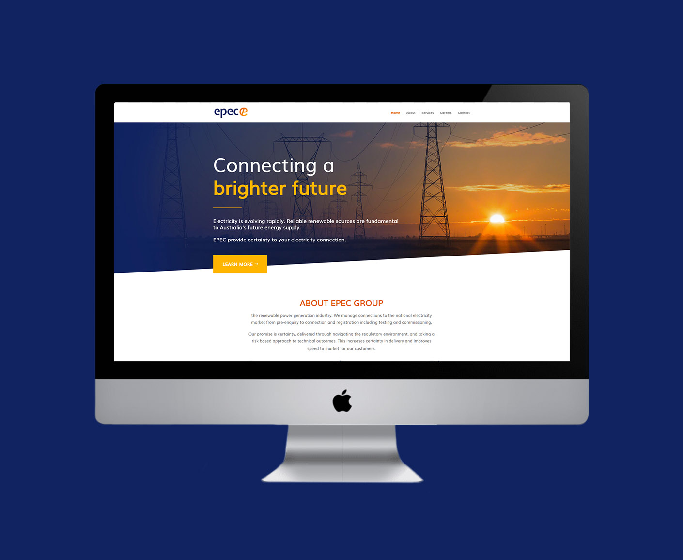
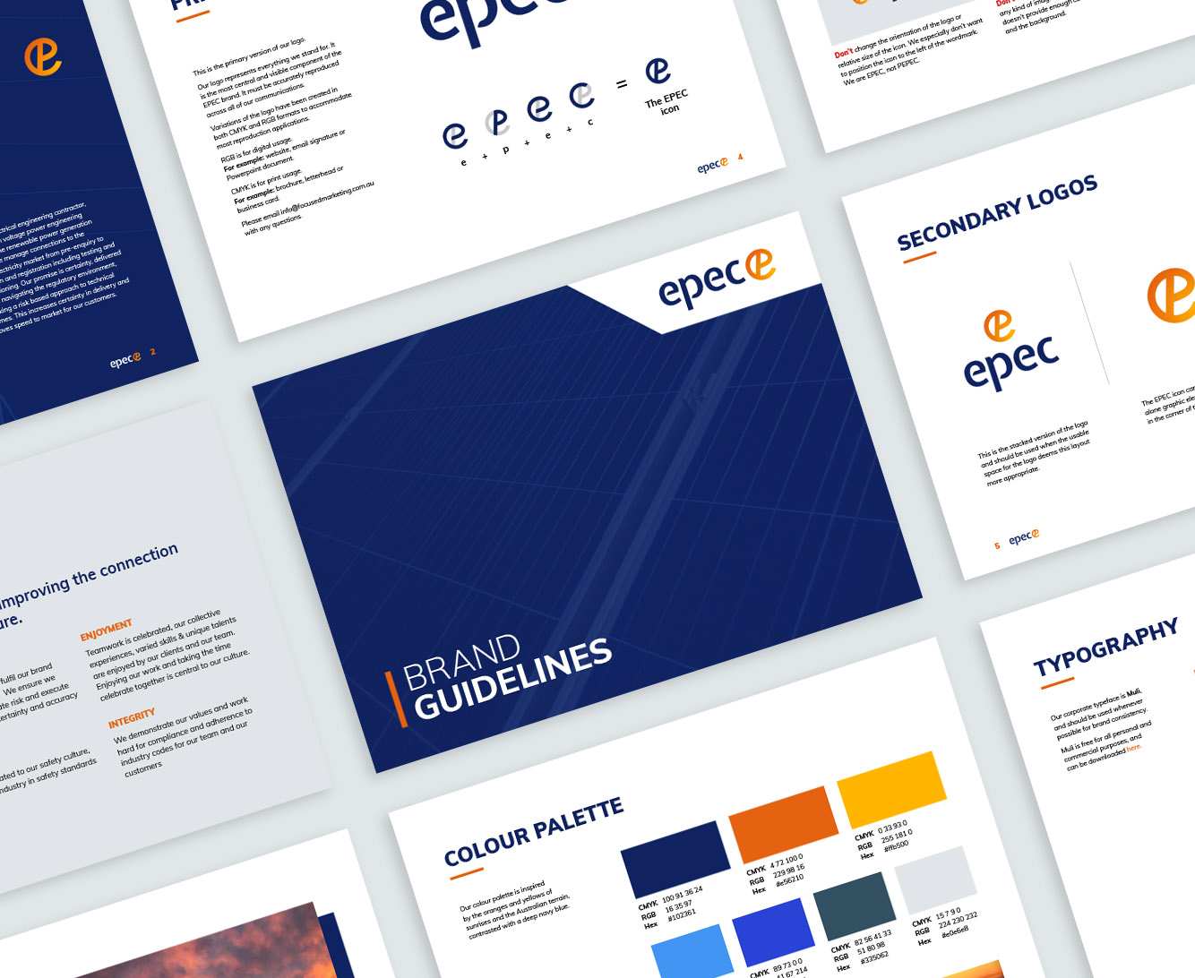
We developed several logo concepts and then rolled out the chosen brand across all touchpoints including a new website and collateral. Of the concepts that were presented, the client preferred the simplest and least abstract logo design, to distance itself from the original.
The radiant orange to yellow gradient used throughout the brand represents innovation, optimism and encapsulates their tagline of ‘connecting a brighter future’.
OUTCOME:
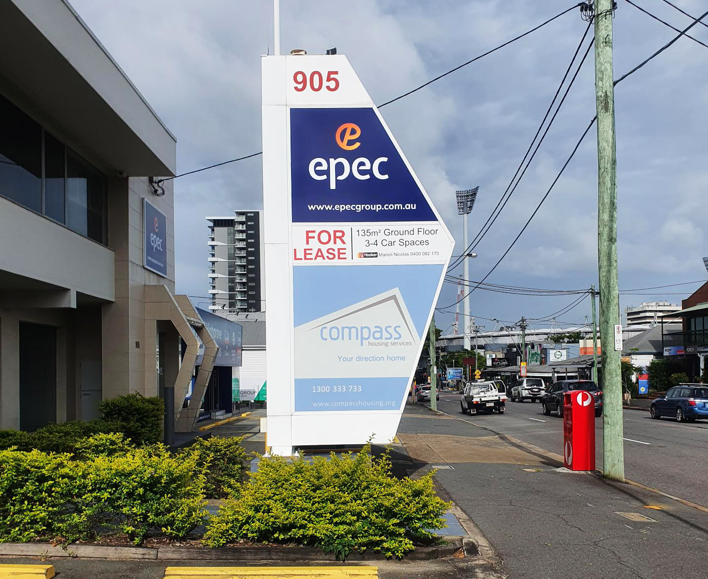
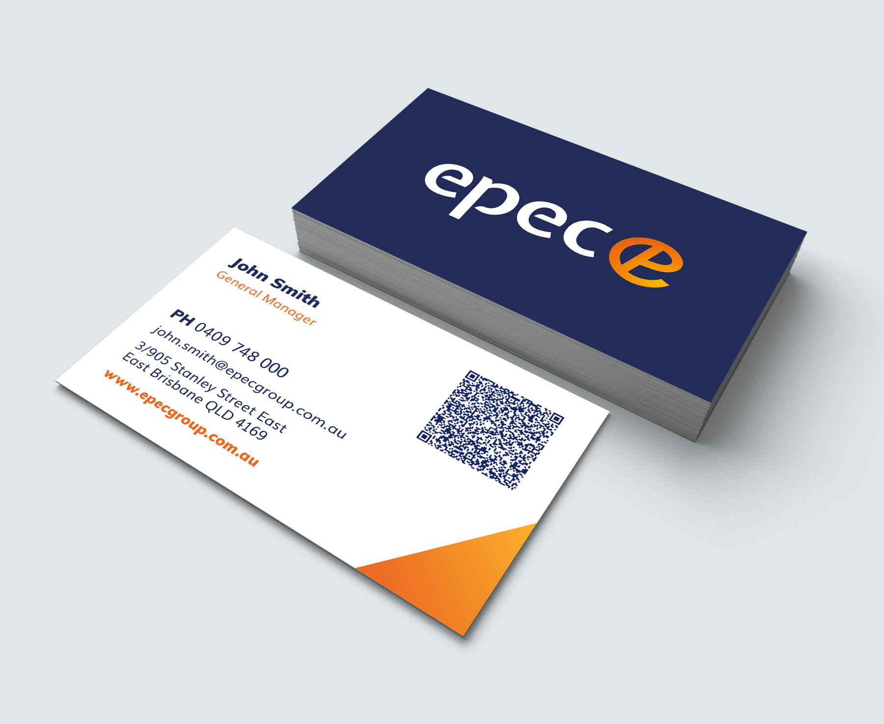
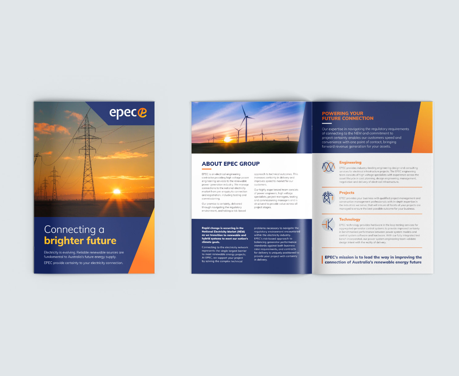
The new branding provides versatility across a variety of applications, from technical documents to company cars and everything in between.
EPEC’s new identity represents their promise of certainty while they provide innovative solutions within the renewable energy space. It is clear, consistent, and future-proof, giving them a professional edge to move forward and grow their business.
