by fmadmin | Feb 12, 2022
REBRAND | LOGO DESIGN | STYLE GUIDE | WEB DESIGN | COPYWRITING | GRAPHIC DESIGN | FACILITIES BRANDING | TEMPLATE DESIGN | MARKETING ASSETS
EPEC Group provide high voltage power engineering services to the renewable energy industry.
They approached Focused Marketing to undertake a brand refresh that would support their ambitious plans of growth within a space that is rapidly evolving.
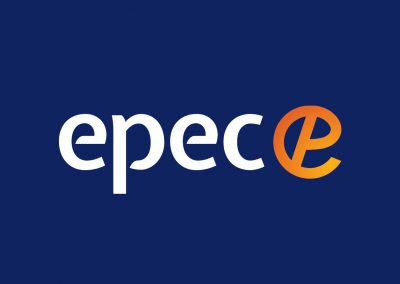
There were issues with the original logo being ambiguous and potential misinterpretations as “C P C C” rather than “E P E C”.
To kickstart the process, Focused Marketing conducted a brand workshop to draw out the brand values and personality that would drive the brand development and marketing goals.
We developed several logo concepts and then rolled out the chosen brand across all touchpoints including a new website and collateral. Of the concepts that were presented, the client preferred the simplest and least abstract logo design, to distance itself from the original.
The radiant orange to yellow gradient used throughout the brand represents innovation, optimism and encapsulates their tagline of ‘connecting a brighter future’.
The new branding provides versatility across a variety of applications, from technical documents to company cars and everything in between.
EPEC’s new identity represents their promise of certainty while they provide innovative solutions within the renewable energy space. It is clear, consistent, and future-proof, giving them a professional edge to move forward and grow their business.

by fmadmin | Nov 12, 2021
REBRAND | LOGO DESIGN | STYLE GUIDE | WEB DESIGN | COPYWRITING | GRAPHIC DESIGN | MARKETING ASSETS
Founded in 2013, Losee Consulting guide their clients as they confront sustainability, climate change and environmental challenges. The team have profound knowledge in their industry and are trusted consultants with a track record of success.
Though the client had committed a great deal of time and effort to the content and upkeep of their old website, it used a WordPress template that was soon to be no longer supported and was becoming outdated. Since it needed an overhaul, they seized the opportunity to refresh their whole visual identity. Focused Marketing were tasked with adding a modern, professional polish to their brand image across all platforms and touch points.
Focused Marketing developed three logo concepts and worked with the team at Losee to implement their chosen logo and brand identity across social media, Word templates, a new capability statement and more.
The logo represents an “L” and “C” for Losee Consulting in an an abstract leaf formation, referring to their connection to the natural environment.
We uplifted and modernised the brand identity, with clean, functional typography and a nature-inspired colour palette drawing from the vibrant greens of foliage, ocean blues and earthy tones.
Losee Consulting were clear in their business strategy, positioning and goals from the outset, they required our guidance however in developing a visual identity and website that truly articulated their experience and professionalism.
The rebrand asserts Losee Consulting as a trusted authority in their industry, and sets them up for continued success with a strong, professional and future-proof brand.
by fmadmin | Feb 12, 2021
REBRAND | LOGO DESIGN | STYLE GUIDE | COPYWRITING | WEBSITE DESIGN & DEVELOPMENT | GRAPHIC DESIGN | STRATEGY | SOCIAL MEDIA | DIGITAL ADVERTISING
Created by a qualified coach, Fresh Start For Me offers online programs to guide people going through a divorce or separation. The 10-week long program offers support and motivation through these challenging times and empowers participants to carve out an even greater life than before.
The existing logo and branding was inconsistent and lacking in polish, and detracted from the credibility, legitimacy and expertise of the program.
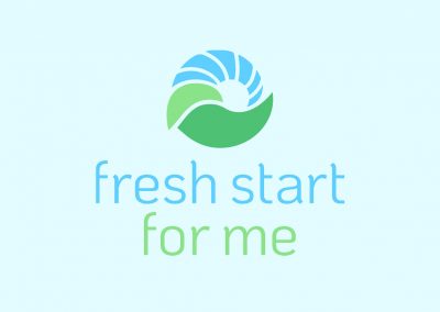
Focused Marketing developed four logo concepts for the client’s consideration. The client preferred the concept most similar to the original logo, representing a sunrise over the hills and green leaves – symbols of growth, hope and new beginnings. We pared back the colour palette to use more calming shades of green and blue.
We created a style guide and applied the new logo across all of the program documentation. We developed a beautiful and functional new website, writing all of the copy as well.
The new website went live and the client began rolling out the new branding across their social media. The Fresh Start For Me brand now presents as a professional service, and the program is preparing for big things in the coming months – watch this space!
If you or someone you know may benefit from the program, you can learn more here.
by fmadmin | Jun 24, 2017
LOGO DESIGN | STYLE GUIDE | BILLBOARD DESIGN | STRATEGY WORKSHOP | MESSAGING
Gemma Lloyd and Valeria Ignatieva founded WORK180 after experiencing a working world that was failing women. Work180 is an innovatively transparent job board helping women around the world to confidently apply to workplaces with a proven commitment to diversity, inclusion, and gender equality.
Focused Marketing was first engaged to provide the creative for a billboard campaign that ran throughout Melbourne. In the process, we talked a lot about brand identity, message segmentation and how the business was perfectly placed to make a difference in an emerging #metoo world. That set us on a path to facilitating a workshop where we developed a strategy for extending brand reach.
Along the way, we designed a logo for the new name, choosing a strong but simple font that uses symmetry to communicate the company’s commitment to fairness and equality. We also transformed the letter ‘O’ into a pink dot, which is now used as an official seal of approval for endorsed employers.
Once Work180’s internal designers started applying the logo to brand assets, we captured everything in a comprehensive style guide to ensure consistency across all platforms.
Fast forward to now and the founders have become respected media commentators on women’s issues, the business has received backing from a group of serious investors and more recently, Work180 has launched in America and the UK.
by fmadmin | Jun 13, 2012
UQ School of Biological Science
BRAND DEVELOPMENT | GRAPHIC DESIGN | TRAINING WORKSHOPS
In mid 2013 The University of Queensland’s School of Biological Sciences, was looking to raise the profile of the school and its new postgraduate masters course. The challenge was to develop new branding for the school which complemented the existing parent brand of the university.
Focused Marketing developed a new visual identity for the school, drawing upon three major themes, international learning, biological science, and the overall student experience. The new design enabled the school to develop a clear identity which could run alongside the overall university brand.
The new postgraduate masters course generated hundreds of enquiries and resulted in over 20 full time participants signing up for the course.


