by fmadmin | Jul 12, 2022
STYLE GUIDE | WEB DESIGN & DEVELOPMENT | COPYWRITING
RM Wealth are an established team of financial advisors who provide personalised financial advice and management to high-net-worth individuals, business owners, professionals and family groups.
We were approached by RM Wealth to update their visual identity and website. They required a website to act as a point of reassurance for their solid client base and new client referrals.
We undertook a brand discovery workshop to inform the development of a new website and the refinement of RM Wealth’s brand. The new brand identity was created to reflect the RM Wealth team, conveying peace of mind, security, and trust. The existing logo was given a subtle refresh, supported by the development of a style guide to ensure brand consistency. This included an expanded colour palette and new typography guidelines.
RM Wealth’s new website showcases their depth of experience, professionalism and expertise, creating a more informative and engaging user experience. The website and revamped brand identity will act as a foundation for RM Wealth’s continuing success.
by fmadmin | Jun 30, 2022
NAMING | LOGO & BRAND IDENTITY | STYLE GUIDE | WEB DESIGN | GRAPHIC DESIGN | COPYWRITING | BUSINESS CARDS | MARKETING ASSETS | CHANGE COMMUNICATIONS
With over 50 years of collective experience, finance experts Rohan Reibelt and Stephen Dionysius approached Focused Marketing ready to branch out and start a business they could call their own.
The as-yet unnamed business would leverage Rohan and Stephen’s wealth of knowledge spanning all areas of finance. Throughout their individual careers, Rohan and Stephen had helped hundreds of happy customers acquire property, refinance, and restructure debt portfolios – simplifying what is often an arduous and stressful process.
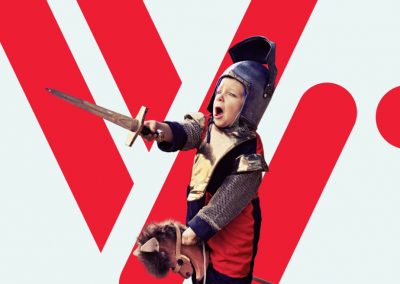
Rohan and Stephen didn’t want to conform to the stuffy, ultra-corporate image many associate with finance businesses. They needed a bold brand identity to capture their down-to-earth energy and resolute passion for connecting their clients with the best loan possible.
Focused Marketing started with an in-depth brand discovery workshop to truly get to know the business. We workshopped several names with Stephen and Rohan, and chose a merging of their first names: Venro.
Venro’s brand identity was inspired by punchy red, black and white designs and geometric shapes and patterns. The logo features bouncing
rounded lines that represent a stylisation of the letters “v” and “r” for Venro, which also form the brand pattern.
We developed every aspect of the brand ahead of its impending launch. This included workshopping the key messaging, copywriting, designing the website, facilitating a photo shoot, assisting with setting up a Google business account, setting up social channels, creating business cards and templates, and ensuring that all touchpoints were consistently branded when the business was ready to go live.
With Focused Marketing directing the change communications, Venro were able to transition many of their existing clients.
Venro was launched in June 2022 to an overwhelming amount of support from their client community.
By investing in their branding and marketing from the very inception of their new business, Venro have been able to maximise the impact of their business’ launch, while fortifying client trust with a professional brand image.
Check out their website here.

by fmadmin | Mar 13, 2022
PR | Logo Design | Graphic Design | Brand Management| Digital Strategy | Website Development
Our client, QTAC, won a competitive tender to deliver an ongoing internship program for the Defence Industry, an initiative of the Australian Government. We were engaged to deliver the brand (logo, flyers, website) for this program and promote its existence to increase applications from both students and SMEs.
Our challenge was to develop a brand identity that represented the new name of the program, Defence Industry Internship Program (DIIP) and appealed to a broad range of stakeholders. We worked closely with QTAC to refine the brand identity of the program and create a logo to reflect this.
We then designed and built the website to ensure compliance with Australian standards for website content accessibility.
We developed and implemented a digital and PR campaign to attract both student and SME applicants to the program.
by fmadmin | Feb 12, 2022
REBRAND | LOGO DESIGN | STYLE GUIDE | WEB DESIGN | COPYWRITING | GRAPHIC DESIGN | FACILITIES BRANDING | TEMPLATE DESIGN | MARKETING ASSETS
EPEC Group provide high voltage power engineering services to the renewable energy industry.
They approached Focused Marketing to undertake a brand refresh that would support their ambitious plans of growth within a space that is rapidly evolving.
There were issues with the original logo being ambiguous and potential misinterpretations as “C P C C” rather than “E P E C”.
To kickstart the process, Focused Marketing conducted a brand workshop to draw out the brand values and personality that would drive the brand development and marketing goals.
We developed several logo concepts and then rolled out the chosen brand across all touchpoints including a new website and collateral. Of the concepts that were presented, the client preferred the simplest and least abstract logo design, to distance itself from the original.
The radiant orange to yellow gradient used throughout the brand represents innovation, optimism and encapsulates their tagline of ‘connecting a brighter future’.
The new branding provides versatility across a variety of applications, from technical documents to company cars and everything in between.
EPEC’s new identity represents their promise of certainty while they provide innovative solutions within the renewable energy space. It is clear, consistent, and future-proof, giving them a professional edge to move forward and grow their business.
by fmadmin | Nov 12, 2021
REBRAND | LOGO DESIGN | STYLE GUIDE | WEB DESIGN | COPYWRITING | GRAPHIC DESIGN | MARKETING ASSETS
Founded in 2013, Losee Consulting guide their clients as they confront sustainability, climate change and environmental challenges. The team have profound knowledge in their industry and are trusted consultants with a track record of success.
Though the client had committed a great deal of time and effort to the content and upkeep of their old website, it used a WordPress template that was soon to be no longer supported and was becoming outdated. Since it needed an overhaul, they seized the opportunity to refresh their whole visual identity. Focused Marketing were tasked with adding a modern, professional polish to their brand image across all platforms and touch points.
Focused Marketing developed three logo concepts and worked with the team at Losee to implement their chosen logo and brand identity across social media, Word templates, a new capability statement and more.
The logo represents an “L” and “C” for Losee Consulting in an an abstract leaf formation, referring to their connection to the natural environment.
We uplifted and modernised the brand identity, with clean, functional typography and a nature-inspired colour palette drawing from the vibrant greens of foliage, ocean blues and earthy tones.
Losee Consulting were clear in their business strategy, positioning and goals from the outset, they required our guidance however in developing a visual identity and website that truly articulated their experience and professionalism.
The rebrand asserts Losee Consulting as a trusted authority in their industry, and sets them up for continued success with a strong, professional and future-proof brand.


